MS Now: A Surprisingly Elegant Rebrand
Courtesy of Versant
Media rebrands usually stink. Quibi. Tronc. Syfy. The graveyard is crowded with names that sounded bold in the boardroom and ridiculous everywhere else, which is why MSNBC’s new identity as MS Now feels like such a surprise. It’s not perfect. It’s not thrilling. But it’s… smart.
Start with the basics. NBC executives wanted the “NBC” part gone from the name. Why? Well, the corporate overlords are spinning off cable networks into a separate entity called Versant. And the NBC brass likely didn’t want the Peacock dragged into partisan food fights every time a primetime host calls out President Donald Trump. Comcast brass have long wanted some daylight between NBC News and the left-leaning cousin it birthed in the ’90s. Mission accomplished.
At the same time, they couldn’t throw everything away. Enter “MS.” For nearly three decades, fans and critics alike have called the channel “MS.” Most viewers don’t even remember it stood for Microsoft-NBC — an odd branding relic from the dial-up era. By holding onto “MS,” the network preserves continuity while still executing a clean split from NBC.
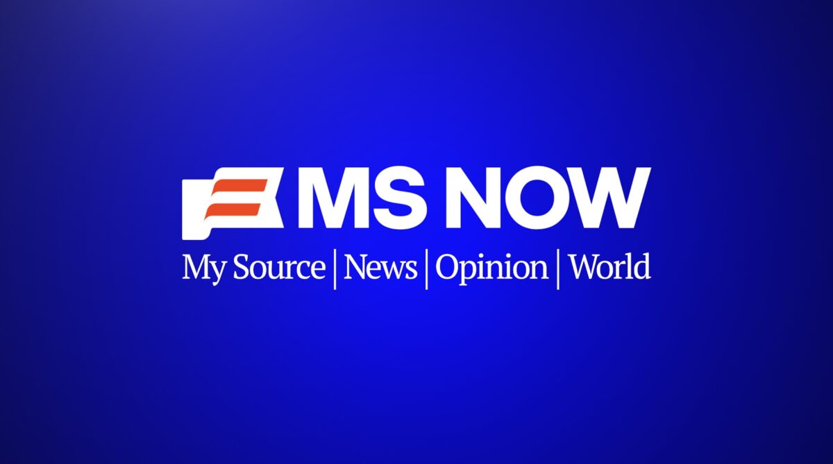
Now, about the backronym: “My Source for News, Opinion and the World.” Nobody seems to love it. It’s clunky. It’s corny. It’s mockable. Social media doyen Yashar Ali snarked, “Not a joke.” But how much does it really matter. Remember what CNN stands for? How about CNBC? ESPN? Exactly. These things get written into press releases, then vanish. Give it a month, and even the network’s own anchors will forget it.
The funny part is what this means for critics. Conservatives have dined out for years on “MSDNC.” It was a cheap but effective dig, because, well it was rooted in the truth of their progressive coverage That option’s gone. The replacements aren’t nearly as good. MS Bow? Maybe, but it sounds polite. MS Kowtow? Too forced. MS Sow? Barnyard humor. MS Wow? That’s a compliment. MS Pow? Honestly, that sounds fun.
In other words, the insult factory just got harder to run, though I suspect something good will soon emerge from a certain Truth Social account. Now that I think about it, “MSDNC” will probably persist…nonetheless.
Jonah Goldberg made the sharp observation that “MS Now” recalls Ms., Gloria Steinem’s seminal feminist magazine. But that’s a cultural reference point that will only resonate with a certain generation of media obsessives. Most people won’t likely make that connection.
And yes, the logo. Critics pounced. They always do. The font looks like a logical continuation of the old MSNBC typeface — slightly cleaner, sharper, more modern. The flag icon is patriotic, though the orange stripes are more creamsicle than Old Glory.
It doesn’t matter much how good this rebrand really was — logos always get dragged at launch. Remember Gap’s 2010 design disaster? Or when Google flattened its logo and people screamed about Helvetica tyranny? Within weeks, outrage turns into wallpaper.
The bigger truth: people hate change. They mock it first, adjust later. I’ve been hard on MSNBC in the past — their handling of Biden coverage, their tendency to preach to the choir — but credit where it’s due. This rebrand works.
MS Now keeps the recognizable shorthand. It distances the brand from NBC at a politically strategic moment. It avoids the fate of Quibi or Tronc. And it manages to do all this without conjuring up some empty buzzword salad that nobody can pronounce.
Not bad, really. In fact, in the chaotic world of media branding, it’s practically graceful.
This is an opinion piece. The views expressed in this article are those of just the author.
New: The Mediaite One-Sheet "Newsletter of Newsletters"
Your daily summary and analysis of what the many, many media newsletters are saying and reporting. Subscribe now!


Comments
↓ Scroll down for comments ↓