COVER WARS: End Of The Decade Brings “Aughts Are Over” Covers
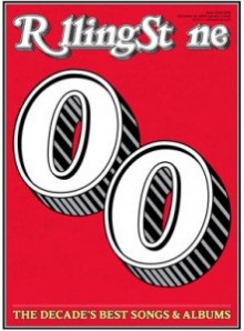
 Rolling Stone loves them a good list and what better time than the end of the decade? For their Albums and Songs of the Decade features, the magazine played it pretty safe, in both music choices and cover selection. Here, it’s minimal and animated.
Mediaite Grade (C+): It’s not that it’s bad — it’s just that it’s boring. The “o” swapped for “0” looks awkward and, as far as we can tell, means nothing, while the lone headline sitting at the bottom of the page is similarly underwhelming. There’s no teasing as to the lists’ content, and if you’re going to stay with the old white man rock contingent, you might as well put Bruce and/or Bob on the cover.
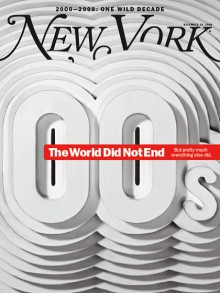
 Due to the unexpected dearth of decade-end covers, New York gets two chances in this Cover Wars, and with their subscribers’ cover, the execution is phenomenal. It’s not that the cover exudes Aught vibes, even, but it’s so visually pleasing — and its creation so original — that you can just get lost in the design. Plus, the headline is ace.
Mediaite Grade (A): “The World Did Not End,” the cover reads, “But pretty much everything else did.” It’s a sentiment that’s hard to argue with, and the vast whiteness of the layered cover does speak to that almost morose outlook in its own way. New York‘s art design was eye-catching throughout the decade and here they’re ending it right. If you doubt the work that went into this one, check out these process shots.
COVER WARS WINNER: New York, Take Two>
Maybe it’s unfair because they got two chances, but the subscribers’ cover of New York seems to be the cover that best exemplifies an erratic and fragmented decade. Like its competitors, it’s minimal, but the cover line hits hardest, it still gets the ’00s in there and it’s the most eye-catching. Disagree? Vote below!
Pages: 1 2
New: The Mediaite One-Sheet "Newsletter of Newsletters"
Your daily summary and analysis of what the many, many media newsletters are saying and reporting. Subscribe now!


Comments
↓ Scroll down for comments ↓