The Aughts In Architecture & Design
The iPod: The aughts were the decade when design finally transitioned from the fetish of a certain subset of the urban elite to broad acceptance within mass consumer society. The iPod, and then the iPhone, are only the most visible manifestations of this shift—beautifully designed products that promised and then delivered entirely new ways of interacting both with the digital and real worlds. Of course, the consequences of these shifts have been dramatic, and not just for makers of digital content. How do you read? How do you communicate? How do you navigate? So much has changed, in so little time.
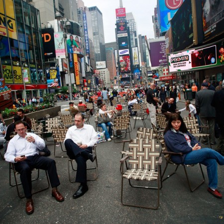
The Rise of Green Design: A decade ago, the field of sustainable design was the province of a small band of architects and designers on the fringes of their respective professions, and hardly covered in the mainstream press. Today, environmental issues are of central concern for practitioners. Progressive urban planning, with an emphasis on energy savings and quality of living, has also made enormous strides. No big city has been more assertive than New York under Mike Bloomberg, whose PlaNYC initiative steps boldly toward a green future.
The Scourge of Twee: Surely the most aggravating design trend of the last decade has been the increasing infantilization—Brooklyn-ization? Seattle-ization?—of the public realm. We’ve seen it in literature, in film, and in music (we can all name the culprits) and now, it seems, in the physical world around us. Who has not grown tired of the post-Starbucks coffee-house aesthetic of irritatingly clever t-shirt graphics, mouldering taxidermy, and mewling songsmiths? An espresso costs more than a martini, and comes with a lecture on soil composition in Honduras. Paging Roger Sterling…
Barack Obama: It was a failure of design—Florida’s infamous butterfly ballot—that was, at least in part, responsible for much of the carnage of the last ten years. How fitting, then, that the success of Barack Obama can be attributed, in its own way, to design. From its early days, the Obama campaign leveraged design to its advantage, using the Internet and its own brilliantly designed website to raise funds and build the grass-roots network that would fuel its victory. The Obama identity, created by Sol Sender of Chicago and featuring the font Gotham, designed by the New York firm of Hoeffler & Frere-Jones, suggested an efficient, modern, and smart candidate who might lead us into a decade that, we can only hope, will act in reverse of the last: a grim beginning rounding into ten years of peace and harmony.
Mark Lamster is the author of Master of Shadows: The Secret Diplomatic Career of the Painter Peter Paul Rubens. A distinguished critic on architecture and design, he can be found at www.marklamster.com.
Pages: 1 2
This is an opinion piece. The views expressed in this article are those of just the author.
New: The Mediaite One-Sheet "Newsletter of Newsletters"
Your daily summary and analysis of what the many, many media newsletters are saying and reporting. Subscribe now!


Comments
↓ Scroll down for comments ↓