The Year’s News In Fun, Graphic Form, From Health Care To Tiger Woods
It’s easy to get caught up in the news craze of the day or the week and lose sight of the larger context. But which stories have really had the largest media impact in 2009?
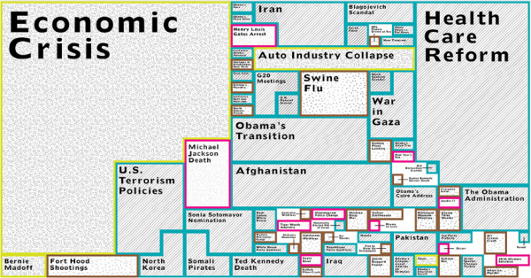
Luckily, there’s a graph for that. The good folks at GOOD have put together an infographic that visually represents the degree to which “print, television, radio, and internet reporting” paid attention to the big stories of the year. Larger graph after the jump:
In many respects, the graphic is a heartening one. As much as it sometimes feels like fluff and soundbites dominated the news cycle, GOOD’s diagram is a portrait of a year that largely focused on hard, substantive policy and politics. With the exception of Michael Jackson‘s death, all of the big boxes focus on things we should be focused on: the economic crisis, the health care debate, terrorism policy, evaluating Obama’s first year.
Then again, the fluff still has a meaningful presence. Did Balloon Boy really get half the coverage of the Iraq war, which will have cost almost $700 billion in total by the end of the year, according to the LA Times? And have Tiger Woods‘ affairs and their fallout really gotten as much airtime as everything that has happened in Russia all year?
It would be interesting if someone made a similar graph for the blogosphere: would blogs be more or less diffuse in what they cover? To what extent they pick up on big, worthy stories that the mainstream media missed? Would Taylor Swift/Kanye West take up an Afghanistan-sized chunk of attention?
GOOD has a clickable, zoomable Flash version of the graphic that’s well worth a news junkie’s time.
(via GOOD)
New: The Mediaite One-Sheet "Newsletter of Newsletters"
Your daily summary and analysis of what the many, many media newsletters are saying and reporting. Subscribe now!


Comments
↓ Scroll down for comments ↓